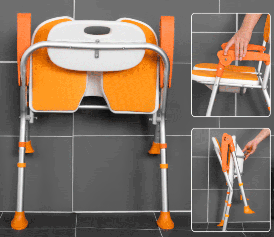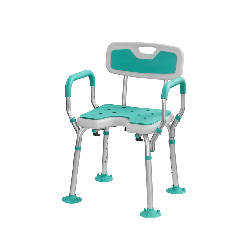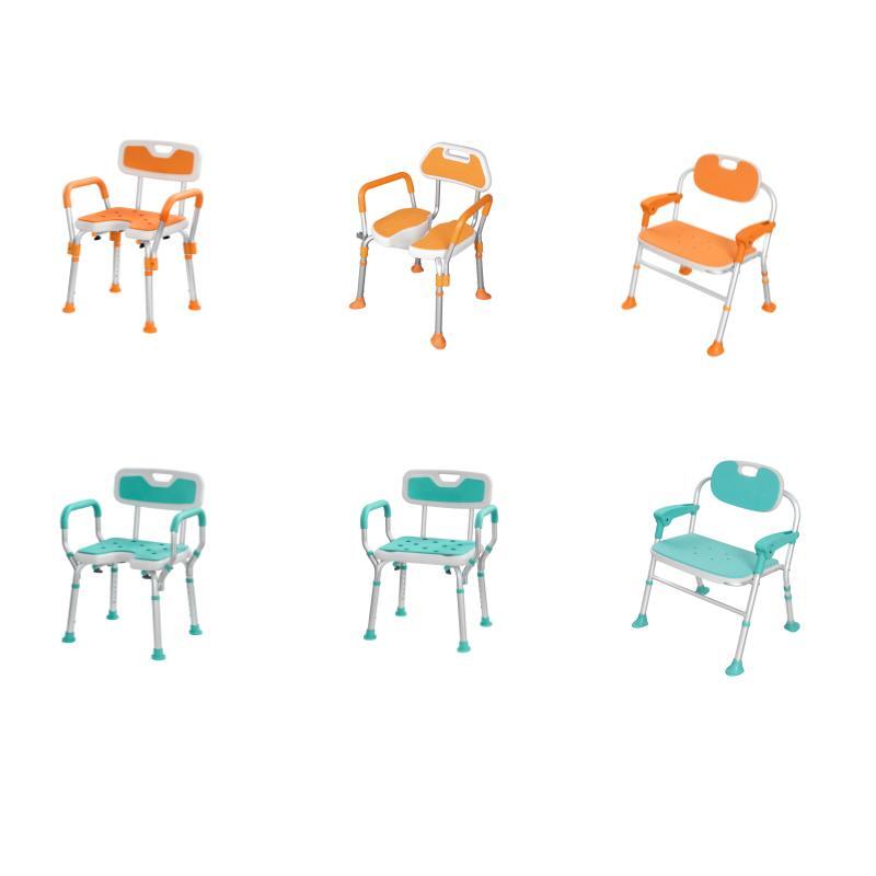
The current trend in the market for home products is to utilize soft and muted colors such as black, white, and gray. These colors not only create a sense of tranquility and calmness, but they are also very much in sync with the modern aesthetics of simplicity and elegance. However, one might wonder why Ageally’s shower chairs embrace a more vibrant and lively color scheme?
Effects of aging on vision
As we age, our pupils shrink, which means we need more light and have a harder time adjusting to different levels of brightness. For example, a 60-year-old’s retina only receives 40% of the light that a 20-year-old’s does, while an 80-year-old’s gets about 15%. This means that older people are less sensitive to light but more likely to be bothered by glare. It becomes difficult for aging eyes to distinguish patterns with low contrast. According to the National Eye Institute, our ability to see contrasts starts declining around age 40 and can drop by as much as 83% by age 80.
Apart from presbyopia, older eyes experience a decline in visual clarity due to reduced contrast sensitivity. This results in slower adjustments between dark and light, making it difficult for elderly individuals to see thin lines and focus on sharp edges. As a result, their ability to read and distinguish similar shapes and colors is affected since edges and lines are important visual cues. Therefore, when designing technology for the elderly, it is crucial to consider the impact of aging on vision.
Dull colors and their impact on older individuals
Dull colors, also known as muted or neutral color, can be further categorized into various shades, such as beige, gray, brown, and white, each with its unique characteristics and uses in design and art. While they may not be as vibrant or eye-catching as bright colors, dull colors can still create a sense of balance, harmony, and understated elegance in a composition.
In the field of color psychology, it’s well-known that dull colors are associated with less excitement and energy. We all acknowledge that colors can really affect our emotions, moods, and overall well-being.
Dull colors like beige, gray, and brown are often associated with feeling bored, tired, and uninterested. This is because they lack the liveliness and excitement of brighter colors that can really grab our attention and get us thinking. Research has shown that being exposed to dull colors can actually make it harder for us to think clearly and be creative or motivated.
The importance of vibrant colors for older individuals
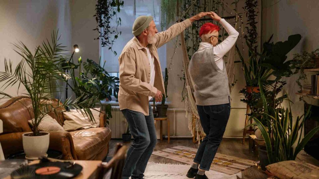
The bright colors are so eye-catching and vibrant that they can really grab the attention of older people. They make them stop and take notice, activating their visual sense in different ways. Just seeing these colors can bring out various emotions like joy, happiness, excitement, or even anxiety depending on the specific color or combination.
In addition to affecting their visual sense, bright colors can also have a profound impact on other senses. For example, certain colors can be associated with specific smells or flavors, such as the vibrant orange of a freshly squeezed orange juice or the deep red of a deliciously ripe strawberry. The sight of these colors can trigger our sense of smell or taste, making seniors feel as if they are experiencing the associated sensations.
Moreover, bright colors can also influence the sense of touch. The texture of a material can be greatly enhanced when it is presented in a bright color, making it feel more vibrant and alive. For instance, the comfort of a shower bath chair or the smoothness of a piece of glass can be greatly enhanced when they are presented in a bright color.
In summary, bright colors and their ability to stimulate the senses can have a significant impact on elderly’s daily lives. They can enhance their experiences, make them surroundings more vibrant and exciting, and even evoke certain emotions and feelings. As such, the use of bright colors in various aspects of life, such as design, marketing, or even personal style, can be a powerful tool for creating a desired effect or experience.
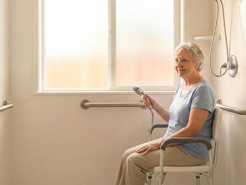
On the flip side, choosing the wrong colors can result in a confusing and uncomfortable environment, worsen feelings of anxiety and restlessness, and even hinder their daily tasks.
Contact with Ageally and get more information!
E-mail:contact@ageally.com
